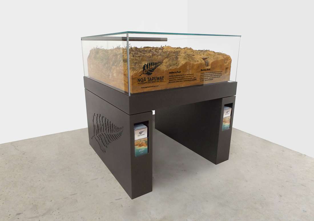
The fern symbol has become a great identifier for the product, encapsulating the symbolism of New Zealand, war and travel – while also evoking a strong sense of pride and national identity for New Zealanders.

In the first phase of the project we needed to create the brand guidelines, identity and marketing strategy for the new product. We worked through a process to create the Ngā Tapuwae name and lockup.
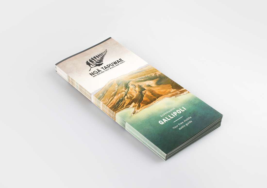
The Ngā Tapuwae brand relies on the significance of the white fern on a dark background, or black fern against lighter landscape photography or illustration. The rest of the palette is fairly monochromatic, contrasting with the vibrancy of modern imagery and illustrations, and integrating with historic black & white and sepia photography. The Ngā Tapuwae brand uses consistent font (Founders Grotesk) across all digital and print applications.
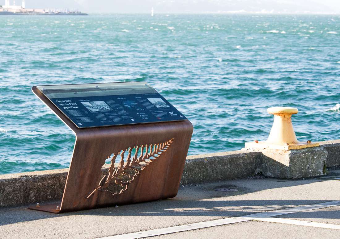
The final work was designed to also be cut out in silhouette, and this allows light and shadow to create an even more emotional effect when deployed as a physical sculpture. One example, cut from steel, waterfront signage in Wellington uses the logo to dramatic effect, marking the departure point of the troops for war in 1914.